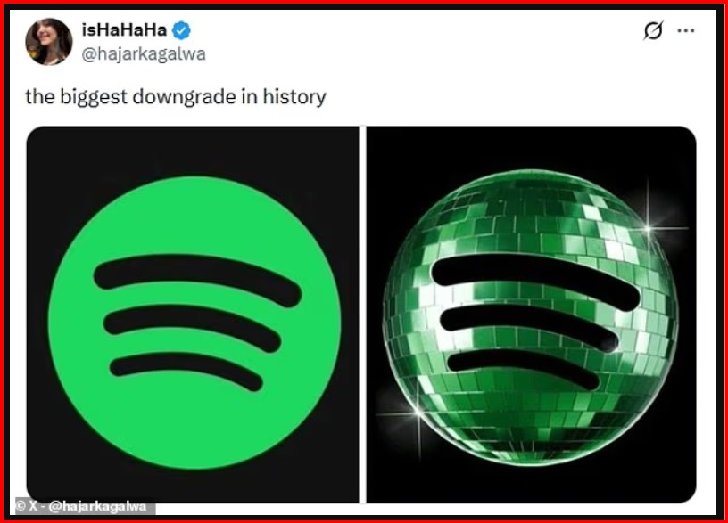
Spotify's new disco ball-inspired logo has sparked a new internet trend, which users are calling "discomorphism."
The logo was released to mark Spotify's 20th anniversary and features a shiny green disco ball. However, the change was not well received by all users. Some criticized it harshly, with one even calling it "the biggest downgrade in history."
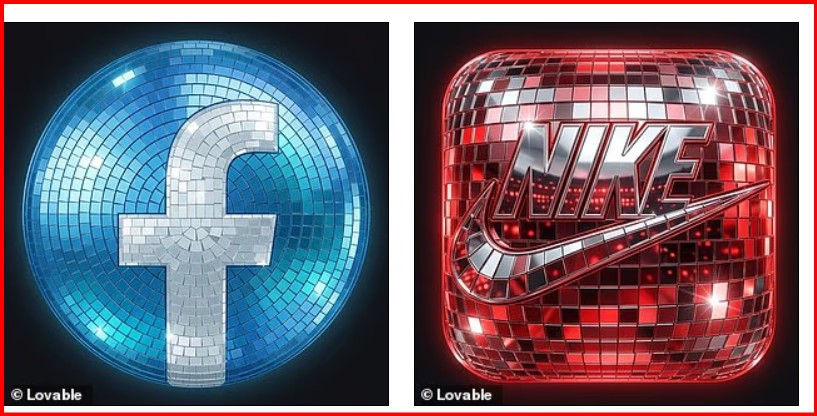
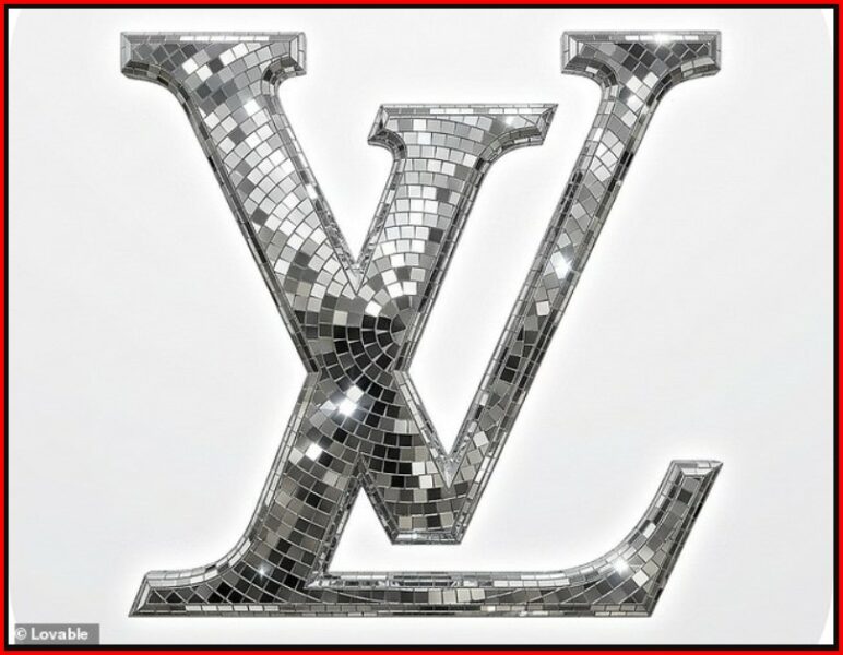
But while some users saw it as a design failure, others were inspired by it and created a new app called "Discomorphism."
The app, developed by Lovable, uses artificial intelligence to give any logo the appearance of a disco ball.
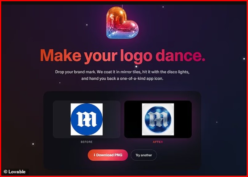
"Make your logo dance. Upload your brand mark. We cover it with mirror tiles, give it disco lights, and give you back a unique app icon," the developers explain.
Users have started sharing their creations on the X platform, turning everyday app logos into disco-sparkling versions. One of them posted an iPhone screen with icons transformed into disco style and humorously wrote: “The era of discomorphism has arrived.”
To try out the app, users can visit discomorphism.lovable.app from their phone or computer. All they have to do is upload a photo of their logo in the box provided and click “Discofy it.” Within seconds, the app turns the standard logo into a bright version covered in a disco ball effect.
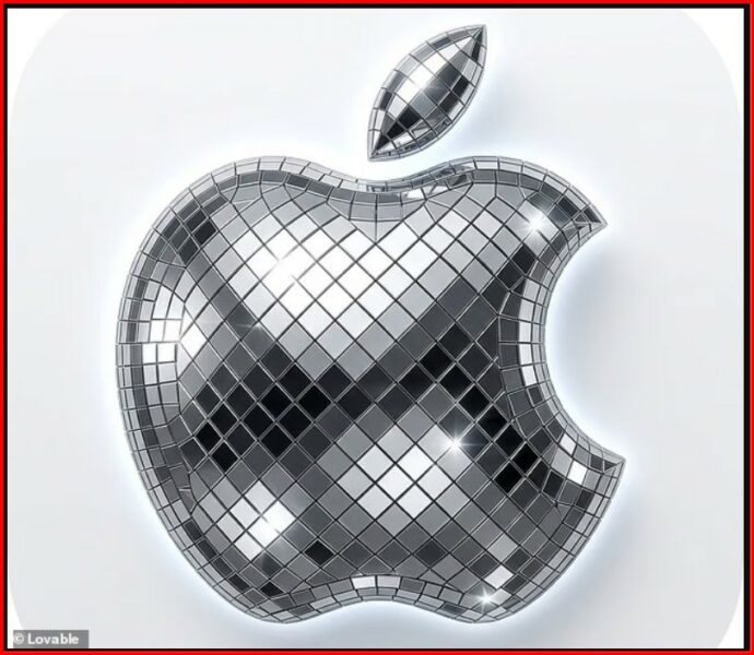
On social media, some users have revealed that they have "discofied" the logos of apps like X, Slack, and Notion. The reactions have been mostly humorous.
“Liquid Glass cancelled. Discomorphism has arrived,” wrote one user. Another commented: “Party all the time on the home screen.”
However, Spotify, the app that started the whole trend, has confirmed that the disco ball logo is only temporary.
After its release last week, many users complained that the mirror-effect panels made the icon look like the app was still loading.
One user on X wrote that this was one of those design and marketing moments that left you stunned. According to him, the logo had major legibility and visual identity issues, as the green was too dark on black and the disco ball texture looked pixelated on the small phone screen.
Another user said they didn't realize it was a disco ball, adding that from the home screen it looked more like a shield. Someone else compared it to an app icon that got stuck during an update.
Following the criticism, Spotify confirmed that it will soon be returning to its usual green logo. Responding to a disgruntled user on X, the company wrote: “Okay, we know that the shine isn’t for everyone. This temporary change will end soon. The usual Spotify icon will be back next week.” /GazetaExpress/


 t7 live